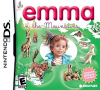
 You would think that after discovering just how bad and a waste of precious life I'll never get back that Emma At The Farm was that I'd never, ever touch another "Emma" game again. But no. I'm evidently a masochist for such punishment. (Plus, I think I picked this up with the other one at the same time, not knowing what it was.)
That aside - first thing's first. Why does this kid look nothing remotely like the one in the first game? Hell, why does the kid in the game not even look like the girl on the cover? (Developer fail.)
This game has even less of a clear-cut plot than the last one did. In this one....apparently there's some groundhogs, and they're missing - or we think they're missing, then it turns out they're just hiding from an eagle who wants to eat them, I don't know. And somehow you complete the story by taking place in a ski competition.
...Say what?
I'm pretty sure whoever wrote the "storyline" for this game was on drugs. Just sayin'. This game is also more difficult on a couple of the levels than the first game (although the rest of the levels are so mindless, it should barely count as a game). This is a game meant for toddlers (probably) and yet, I'm 25 and couldn't figure out how to win a couple of the levels and got so frustrated that I had to turn it off. (Even when I did figure it out? This does not seem like something a toddler could get the hang of.) Like with the other Emma title, you unlock bonuses as you go along...although I'd be amazed if anybody ever actually looked at them, they're so boring. (Yes, one of your bonuses are FACT SHEETS.) I don't know what they were thinking, but they really dropped the ball on this one. There's no way ANYBODY'S going to enjoy this game, let alone a little kid. (And I even let my toddler-age nephew give it a shot.) I'm giving this game a 1 out of 10 snowballs. Epic fail.
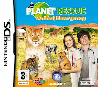
 Correct me if I'm wrong, but the cover of this game implies that you'll be working with exotic, safari type animals in this game. Lions, zebras, tigers, giraffes, you name it. Seems like an interesting shift from the usual vet games...
Your game starts up, and you have to watch a poor quality 3D animation of your animal shelter, where evidently you have a pet tiger cub. Don't ask me why. Nevermind that you bend down to pet a dog while this tiger is running at your heels. ....Is it just me, or would the tiger not just eat the dog while he's at it? Eh, whatever...
This is about as close to the game the cover portrays that you're going to get. You're playing the role of a vet who has her own clinic, who, just like every other vet game on the market, specializes in cats, dogs, and rabbits. But wait! Your first patient it...a baby tiger cub! Seems exciting. Except that this tiger cub never once becomes relevent again, despite the fact that you keep him for the whole game.
Basically, the plot is this: A lot of the animals living in the general area have been contracting mysterious patches of itchy spots on their bodies, and nobody can quite figure out what they are. They've been making the animals very sick, however, so this is a problem that can't be ignored. It's your job to eventually figure out what's going on. (I won't give a spoiler and tell you what it ends up bring, but I will tell you this: it's very predictable.) So you diagnose their ailments, treat them, nurse them back to health, the whole shebang. Nothing particularly new or groundbreaking here, folks. But then again, given the genre...did you truly expect there would be something?
As the game progresses, you'll learn to do housecalls for horses, and eventually be taken to the large rescue station to help wild animals...the extent being pandas, tiger cubs, grizzy bears, and baby seals. Now, how does that live up to the cover of the game? I have no idea. Especially since you'll get maybe 5 requests, tops, to help them at all.
For a young player where repetition is key, they'd probably love this game. For adults, though? It's just monotonous and boring. More or less just a waste of your time. Rating this a 4 out of 10 baby tiger cubs.
 So, I'm not going to lie about my age here - I was a child of the 90's. As such, much as basically any kid of my generation will remember were all the educational computer games from the software company MECC. These games were phenomenal for the times, although they all had a distinct style to them you could spot a mile away.
Guess what? I think this game may have had some of the same developers. I'm pretty dang sure.
Your mission, should you choose to accept it, is to try and solve an ancient Mayan code (oh, hello Mayaquest...) by deciphering their heiroglyphics. On the way, you'll be served up an educational storyline...which not going to lie, I didn't read much of because I just wanted to get on with playing the game.
Anyhow. 90% of this game is your typical I Spy style of game, which seems to becoming increasingly popular on the DS system. You're presented with a list of items that are often pretty expertly hidden in your locations you visit. There's 20 missions, but for each mission, there's about 3 to 5 levels on average. You'll be busy for a while.
Once you find everything on your list and complete the level, you'll be brought to the next one, where you have to spot 5 or 6 subtle differences between the top and bottom screens. Most of these are pretty obvious, but there's usually at least one you need to use a hint for.
After this, you'll get a puzzle slider. Just as the name implies (although I KNOW you all know what a puzzle slider is), you slide the tiles around until you re-piece the photo together.
You'll then be introduced to a matching memory game. It switches up... Sometimes it wants you to find perfect matches, sometimes it wants you to find similar items that are the same KIND of item, but still different...and sometimes it wants you to find related items, such as a screw and a screwdriver, a tire and a car, etc.
Finally, to finish up your level, a mah jongg type of puzzle... except that I don't think you can fail this one, so it's much less frustrating, but also much less strategic in its approach and means you won't be doing much thinking here. (And that's the entire reason I like mah jongg in the first place.)
The game is fairly straightforward, and more of just a good time-killer than anything. The graphics are fantastic, and the sounds and music aren't too bad either. The controls are a *little* bit touchy, but DS controls are hardly ever entirely accurate. You can't win em all. I'm not going to go and say that this is the best game ever, because it's not, but it's not bad either. I'm going to rate this one a 6.5 out of 10 Mayan temples.
 When you hear the name America's Next Top Model, what do you think of? Probably things like fashion, glamour, vogue... The series itself is a hit or miss; you either love it or you hate it. I personally don't care for it much, but I can appreciate it for what it is. Now... when somebody makes a game of a show, you expect it to at least be a little bit relevent, right?
Wrong.
Who knows if this game was even licensed...Tyra Banks doesn't make a single appearance in the game. And ANYONE who's ever seen the show knows how central she is to the series. There's an immediate docking of points right there for me. Second...well, to put it bluntly, this game sucks. You start out in your chic, modern NY (I assume) apartment, where you'll find your fashion consultant (who does absolutely NOTHING), a personal shopper (who also does zilch except stand there and look pretty) and....that's your whole team. Great, isn't it? You'll also find that navigating through your apartment is SO much more difficult than need be and that they should've just cut this entirely from the game. The only actual things you do here are you check your PDA each morning to see what your schedule for the day is, and you eat a bowl of fruit on your way out the door. You aren't allowed to leave your apartment until you do so. Now, I can understand the reasoning of this - I'm sure it's a subtle anti-anorexia ploy by the game developers, knowing that young impressionable girls will be playing this game. However, your fashion consultant insists you eat an apple before you leave...and your model eats the whole bowl. Um. Prelude to bulimia, anyone? (I mean, she is a model. She just binged. Her manager would probably force her to go purge if they found out.) Honestly, they could have entirely done away with the apartment scene altogether and nobody would be any the wiser. (Anyone who's played the game would quickly tell you that it'd be better without it.)
That aside, there's only four things you do in this actual game. You go by the schedule of a work week, Monday through Friday, so one of these activities WILL be repeated at least once throughout your week. You have four options:
- Makeup
- Creating outfits
- Photoshoots
- Practicing your catwalk
...Doesn't sound too thrilling, does it? (Trust me. It isn't.) Let's touch upon each of these in order, shall we?
In each of the makeup rounds, you're given a model, and are supposed to make her over in 3 minutes or less. Nevermind that the application process in this game is slow, tedious, and it takes trial and error to even figure out if you're even close to getting it right. You get a tiny picture in the corner of the screen that you're supposed to copy. ....HA. HA HA HA HA HA. That's funny. You can copy it EXACTLY, and you'll still fail. You have to watch the style meter on the left screen (oh, did I mention this game requires you to hold your DS sideways like a book? ...I didn't? Well, you do. Which only adds to my annoyance with this game even more.) and if you have the wrong shade of makeup, it won't move. If you have the correct shade, keep applying it until there's nowhere else to put it, so the bar keeps raising. Simply going by the reference picture will NOT help you achieve this, I found. Now, you also have to apply about 2 or 3 coats of each type of makeup. RIDICULOUS. This has got to be one of the most stressful, yet nonsensical makeup games ever.
Then we have the outfits you throw together. This is at least a little bit easier...you just pick a top, a bottom, and shoes. You're thrown a general style to try and create an outfit for, but again, following that won't give you top marks. It's pretty much trial and error...go down through the pieces, see which ones raise the style bar the most, and use them. Usually, the pieces look TERRIBLE together, but you get reviews such as: "Oh! That is so fresh and modern!" *eyeroll*
Then, photoshoots. I thought this would be the best part of the game, but no. Nooooo. All you do is you trace your stylus over a weird pattern that shows up on the right screen, and if you get it exact, you get a top score for that photo. Miss a little of the pattern (which is often what happens, since you only get THREE SECONDS to trace them) and you get half points. Don't make it to the end of the pattern, and you fail it. You have 10 photos to take each time. Meanwhile, on the left screen, your model does the same few poses over...and over...and over...
Finally, this brings us to the catwalk. In addition to practicing it throughout the week, you'll also be required to finish off every week with a catwalk faceoff. Now, in the practice mode, you walk the catwalk 3 times. At the end of the week, you only get one shot. Anyhow, you must tap your stylus back and forth in time with every step perfectly so your model doesn't trip. Then, like with the photoshoots, same thing: tracing designs in 3 seconds or less to hit the pose. (Also, you may fall down if you miss in this one.) Then you get your evaluation at the end.
There's no real elimination process in this game. You never even meet your "competition", nor does your performance seem to affect the outcome of the game. It seems impossible to fail out. The whole game seemed to be put together very quickly and cheaply, if you ask me. Especially for one with such a big name show backing it. Overall, I was extremely disappointed with this title. If I were you, I would NOT waste my time playing it...none of it's even fun. Rating it a 2 out of 10 runways.
 You would think that after discovering just how bad and a waste of precious life I'll never get back that Emma At The Farm was that I'd never, ever touch another "Emma" game again. But no. I'm evidently a masochist for such punishment. (Plus, I think I picked this up with the other one at the same time, not knowing what it was.)

